Data without visibility is just storage. Most businesses collect more data than they can process — from sales systems, customer databases, operations software, financial tools — but the insight stays locked inside each system, available only to whoever logs in and knows where to look.
A business dashboard changes that. It aggregates data from multiple sources, visualizes it clearly, and surfaces the metrics that actually drive decisions — in a single view, updated in real time. The right dashboard turns a morning of report-pulling into a 30-second check.
What is a business dashboard?
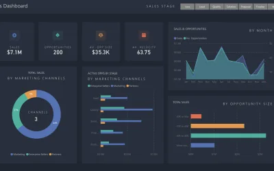
A business dashboard is a data visualization tool that provides an at-a-glance view of key performance metrics. Think of it as the instrument panel for your business — the same way a car's dashboard shows speed, fuel, and engine temperature at a glance, a business dashboard shows revenue, conversion rates, inventory levels, or whatever metrics matter most to your operation.
Good dashboards pull data from multiple sources — CRM, accounting software, website analytics, operational systems — and display it in a unified view. The goal isn't to show everything; it's to show the right things, clearly enough that the next decision is obvious.
Key features of effective dashboards
Clarity and simplicity
A dashboard crammed with 40 metrics is not more useful than one showing 8. It's less useful. Every metric added to a dashboard competes for attention. The discipline of designing a good dashboard is the discipline of deciding what to leave out.
Relevant and actionable information
Metrics should connect directly to decisions. If a number can't change how someone behaves, it doesn't belong on the dashboard. The test is simple: if this metric moves in an unexpected direction, what action does that trigger?
Real-time or near real-time data
A dashboard showing last month's data is a report. A dashboard showing what's happening now is a tool. The value of a dashboard scales with how current the data is — for operational decisions, that means minutes or seconds, not days.
Integration with existing systems
Data sitting in separate systems is data that requires manual consolidation. An effective dashboard integrates directly with your source systems, pulling data automatically so the numbers are always current without anyone updating a spreadsheet.
Types of dashboards
Strategic dashboards
For leadership and long-term decision-making. Strategic dashboards show high-level KPIs aligned with organizational goals — revenue growth, market share, customer lifetime value. They're reviewed weekly or monthly, and they answer the question: are we on track?
Operational dashboards
For day-to-day management. Operational dashboards show what's happening right now — active orders, support queue depth, production throughput, delivery status. They're monitored continuously and trigger immediate action when something goes wrong.
Analytical dashboards
For deep analysis and pattern identification. Analytical dashboards support exploration — slicing data by segment, time period, product, or geography to understand why something is happening, not just that it is. They're used by analysts, not by people who need a quick answer.
Best practices
- Define clear goals before designing. What decisions will this dashboard support? What does the user need to see to make those decisions? Start there, not with the data you have available.
- Choose the right visualization for each metric. Line charts for trends over time. Bar charts for comparisons. Single numbers (KPI cards) for the most critical metrics. Don't use pie charts for more than 3-4 segments.
- Design for the user, not the designer. The dashboard needs to make sense to the person who reads it daily, in context, under time pressure. Test it with actual users before finalizing.
- Update it as the business evolves. The metrics that mattered at launch may not be the right metrics six months later. A dashboard that nobody reviews is a dashboard that needs to be redesigned.
Tools & platforms
The right tool depends on your data sources, technical team, and budget:
- Tableau / Power BI / QlikView — Business intelligence platforms with rich visualization capabilities. Good for organizations with dedicated analysts and existing data infrastructure.
- Metabase / Redash — Open-source options that connect directly to databases. Excellent for technical teams who want control without enterprise pricing.
- Domo / Klipfolio / Looker — Cloud-based platforms with strong integration libraries. Good for teams that need to connect many different data sources quickly.
- Custom-built dashboards — When your data sources, business logic, or visualization requirements are specific enough that off-the-shelf tools can't handle them cleanly. Gives complete control over what's shown and how it's calculated.
Real examples
Sales performance dashboard. Tracks pipeline health — leads generated, conversion rates, average deal size, revenue by period. Salespeople see their individual performance; managers see team-level trends and identify where deals are stalling.
Financial dashboard. Revenue, expenses, cash flow, and profitability in one view. Finance teams can see burn rate in real time rather than waiting for end-of-month reconciliation. Anomalies surface immediately instead of weeks later.
Customer service dashboard. Ticket volume, response times, resolution rates, and satisfaction scores. When response time spikes, managers see it immediately and can add capacity before customers start complaining.
Supply chain dashboard. Inventory levels, order fulfillment rates, supplier lead times, and delivery performance. When stock drops below threshold, the dashboard flags it before it becomes a stockout.
In business, data is the raw material. A dashboard is the factory that turns it into something you can act on.